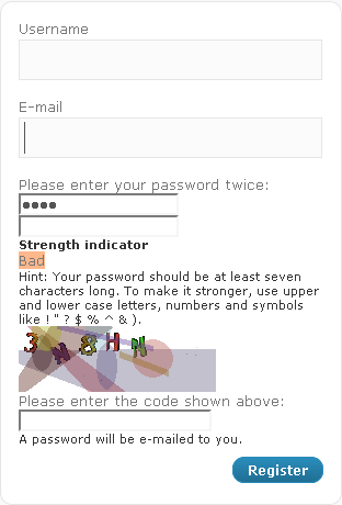
I just installed Sabre 0.9.0 to have a secure registration form for my WordPress pages. Basically it’s a really nice plugin (thank you for providing it!), but I think the registration form is really bad looking by default:

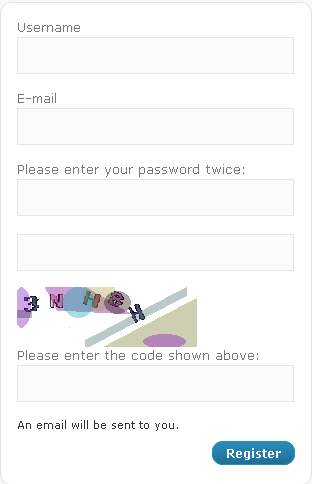
After some changes in the code it looks like this:

This is what I thought and did:
- I want the user to be able to define his password at registration. So, “A password will be e-mailed to you” does not make any sense. Therefore I changed
wp-login.php line 418 to:<p id="reg_passmail"><?php _e('An email will be sent to you.') ?></p>
- The password strengh calculator is nonsense in this case. In this case, nobody uses a personal password getting evaluated as “strong”. And, while the calculator switches from “Too Short” to “Bad” when you have at least 4 chars, the password is actually still too short, because Sabre wants a password of 6 chars at minimum. Additionally, the note that one should use special characters looks bad. I kicked the whole notice out and chose a minimum of 4 chars:
In wp-content/plugins/sabre/classes/sabre_class.php comment out the lines 113/114://echo '<strong>' . __('Strength indicator') . '</strong><br />'; //echo '<label id="pass-strength-result">' . __('Too short', 'sabre') . '</label><br />' . __('Hint: Your password should be at least seven characters long. To make it stronger, use upper and lower case letters, numbers and symbols like ! " ? $ % ^ & ).');
Go to lines 326/327 and modify it to your required number of characters (in this case 4):
}elseif(strlen($_POST['user_pwd1'])<4){
    $error_msg_text = __('Password length is less than 4 characters.', 'sabre');
- Okay, these logical things are fixed now, but the design is still bad. You need to adjust wp-admin/css/login.css line 98 by adding the id’s #user_pwd1, #user_pwd2 and #captcha. It then looks like:
#user_pass, #user_login, #user_email, #user_pwd1, #user_pwd2, #captcha {
	font-size: 24px;
	width: 97%;
	padding: 3px;
        [...]
That’s it. Your registration form should now look like in the picture above.
Leave a Reply