Every now and then I do a little bit of data mangling for personal use using tools that I got to appreciate, mainly during professional work.
In this blog post I would like to share an example for simple and yet powerful end-to-end data processing using Google Sheets, Python, and Pandas (and I have to notice: my first blog post about data analysis with Pandas is already more than six years old, time flies by).
Raw data in a spreadsheet: a date and a distance for every run
I have a chaotic spreadsheet in Google Sheets where I keep track of my runs. It is easy to edit from the smartphone, and synchronized across devices.
This is a screenshot of a part of that spreadsheet (hiding some irrelevant columns, showing only a small fraction of the rows):
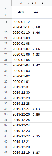
Each row in the date column refers to a specific day using the text format YYYY-MM-DD. Some rows in the km column contain numerical values. Each of these means that I have made a run of the distance given by the value, in kilometers, on the corresponding day. Missing values in the km column mean that on those days I did not do a run (or forgot to keep track of it). In the screenshot, it looks like days in the date column are represented without gaps, but that is not important.
Now you know about the kind of data that I have been entering manually for about half a year, about my runs.
Analysis goal
My goal today was to do a tiny bit of data analysis — for myself — and to then write this blog post, for you :-).
In terms of data analysis, my goal was to look into the evolution of my running performance over time. I wanted to start by looking at “running distance per week”. Specifically, my goal was to perform a rolling window analysis with a window width wider than a week (to focus on changes on longer time scales more than on fast fluctuations), and to plot the outcome.
So I built a small tool using Python and Pandas which
- automatically fetches the current dataset from Google Sheets (as a CSV document)
- processes and prepares the data (removing dirt, filling gaps, …)
- performs statistical analyses
- creates a plot (and writes a PNG graphics file)
Results first
Here is some code: https://github.com/jgehrcke/runni/blob/master/runni.py
Here is how I use it, and how you can use it, too:
# Get the code.
$ git clone https://github.com/jgehrcke/runni && cd runni

# Enable link sharing to the Google Sheet (so that anyone
# with the link can access the sheet). Get the corresponding
# ID/key from the URL, and set it as an environment variable
# (it's sensitive data).
$ export RUNNI_GSHEET_KEY='[snip]'

# Dependencies: Python 3, pandas, matplotlib, requests

# Run the analysis program.
$ python runni.py
...
200112-19:57:39.060 INFO: Writing PNG figure to 2020-01-12_running-distance-per-week-over-time.png
The resulting plot:
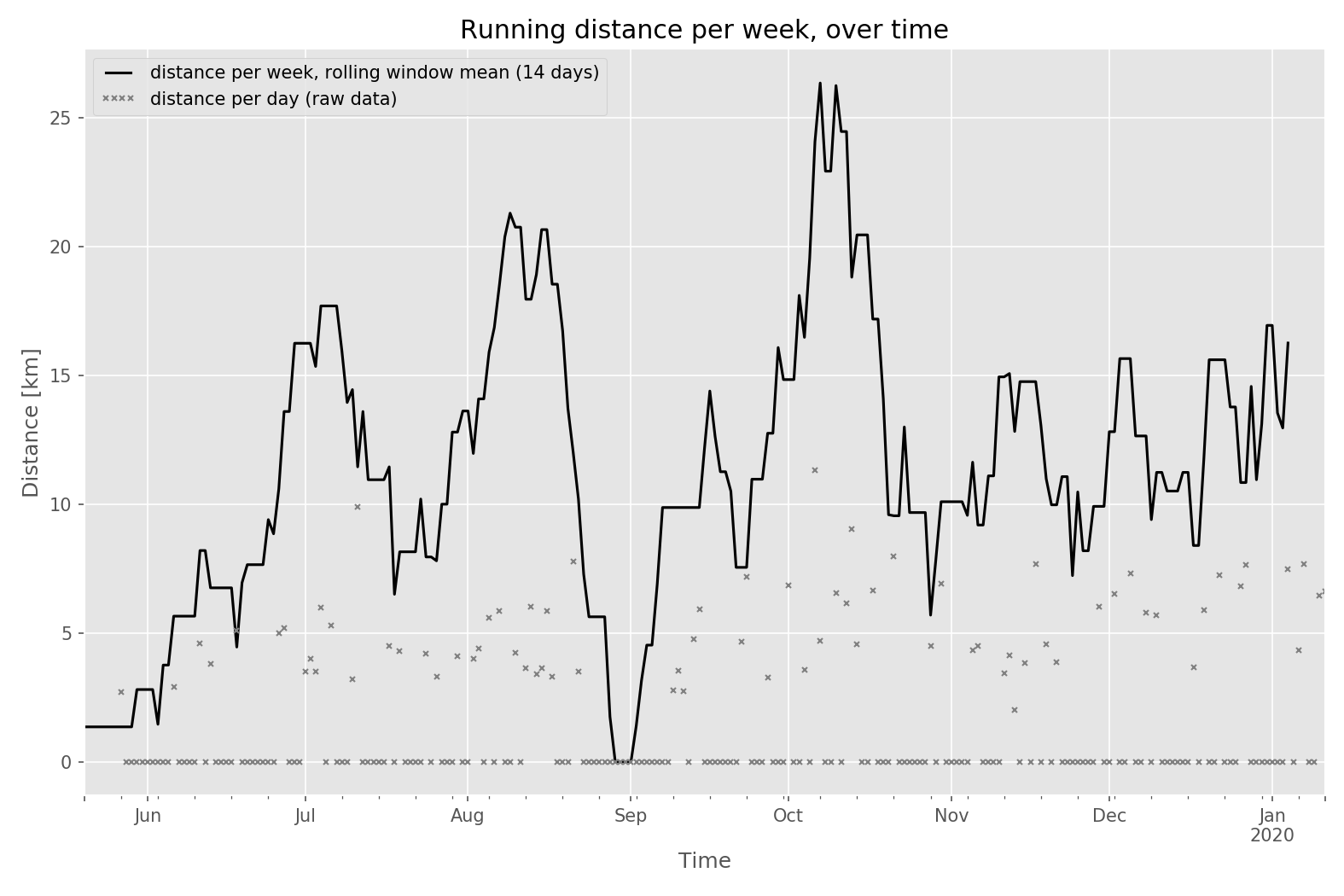
For each day in the data interval, a small gray data point explicitly shows the distance I ran on that very day (on most of the days this is 0 km). In the majority of the cases, every non-zero gray data point corresponds to a single run (the only run on the corresponding day), but more generally it is the distance sum of all runs on that very day.
The thick black line is the “distance per week”, derived from a rolling window analysis with a window width of 14 days.
in-Pandas data processing in more detail (the non-trivial part)
The following code block (from here) with its code comments shows the core of the in-Pandas data processing and is the main reason for why I write this blog post: I think this is a non-trivial part. In previous projects (goeffel, bouncer-log-analysis, dcos-dev-prod-analysis) I actually put a bit of thought into how to do a meaningful rolling window analysis with Pandas, and here I am simply re-using what I learned before. But some of that it is still non-trivial and deserves an explanation.
The code comments are supposed to provide a hopefully helpful level of explanation. From the comments, it should at least be obvious that several decisions need to be made before the data in the spreadsheet can be analyzed in a meaningful way in a rolling/sliding window analysis.
# Keep only those rows that have a value set in the `km` column. That is
# the criterion for having made a run on the corresponding day.
df = df[df.km.notnull()]

# Parse text in `date` column into a pd.Series of `datetime64` type values
# and make this series be the new index of the data frame.
df.index = pd.to_datetime(df["date"])

# Sort data frame by index (sort from past to future).
df = df.sort_index()

# Turn the data frame into a `pd.Series` object, representing the distance
# ran over time. Every row / data point in this series represents a run:
# the index field is the date (day) of the run and the value is the
# distance of the run.
km_per_run = df["km"]

# There may have been more than one run per day. In these cases, sum up the
# distances and have a single row represent all runs of the day.

# Example: two runs on 07-11:
# 2019-07-10    3.2
# 2019-07-11    4.5
# 2019-07-11    5.4
# 2019-07-17    4.5

# Group events per day and sum up the run distance:
km_per_run = km_per_run.groupby(km_per_run.index).sum()

# Outcome for above's example:
# 2019-07-10    3.2
# 2019-07-11    9.9
# 2019-07-17    4.5

# The time series index is expected to have gaps: days on which no run was
# recorded. Up-sample the time index to fill these gaps, with 1 day
# resolution. Fill the missing values with zeros. This is not strictly
# necessary for the subsequent analysis but makes the series easier to
# reason about, and makes the rolling window analysis a little simpler: it
# will contain one data point per day, precisely, within the represented
# time interval.
#
# Before:
#   In [28]: len(km_per_run)
#   Out[28]: 75
#
#   In[27]: km_per_run.head()
#   Out[27]:
#   2019-05-27    2.7
#   2019-06-06    2.9
#   2019-06-11    4.6
#   ...
#
# After:
#   In [30]: len(km_per_run)
#   Out[30]: 229
#
#   In [31]: km_per_run.head()
#   Out[31]:
#   2019-05-27    2.7
#   2019-05-28    0.0
#   2019-05-29    0.0
#   2019-05-30    0.0
#   ...
#
km_per_run = km_per_run.asfreq("1D", fill_value=0)

# Should be >= 7 to be meaningful.
window_width_days = opts.window_width_days
window = km_per_run.rolling(window="%sD" % window_width_days)

# For each window position get the sum of distances. For normalization,
# divide this by the window width (in days) to get values of the unit
# km/day -- and then convert to the new desired unit of km/week with an
# additional factor of 7.
km_per_week = window.sum() / (window_width_days / 7.0)

# During the rolling window analysis the value derived from the current
# window position is assigned to the right window boundary (i.e. to the
# newest timestamp in the window). For presentation it is more convenient
# and intuitive to have it assigned to the temporal center of the time
# window. Invoking `rolling(..., center=True)` however yields
# `NotImplementedError: center is not implemented for datetimelike and
# offset based windows`. As a workaround, shift the data by half the window
# size to 'the left': shift the timestamp index by a constant / offset.
offset = pd.DateOffset(days=window_width_days / 2.0)
km_per_week.index = km_per_week.index - offset
Closing remarks
- What is shown above is I think a well-confined, simple example for real-world data analysis. I like the architecture of maintaining raw data in Google Sheets to then consume it via HTTP for analysis using proper tooling (the data analysis and plotting options within Google Sheets are very limited, heck). With that example, I hope I can inspire some of you people out there to do similar things. There are endless possibilities: in my spreadsheet, I have other columns such as the run duration, … :-).
- I will keep adding data points to my spreadsheet after about every run and will keep re-generating the graph more or less regularly for my entertainment.
- The meaning and impact of the window width in the rolling window analysis are critical. I have not explained that above. I think one of the best ways to grasp it is to visually play with it — that’s what the
--window-width-daysargument can help with. - Again, you can find the code for inspiration here: https://github.com/jgehrcke/runni
Leave a Reply