Introduction
Wired reported, SPIEGEL ONLINE reported, Adobe contributed, Twitter and Facebook went crazy like hell — it’s like half of the world discusses the colors of a dress today. One thing upfront: no sensation here, at all. The level of “virality” of this story and its scientific impact are not related. Still, there are various important aspects about this topic which I want to bring into order and contribute to the discussion.
I think the most revealing insight of this development is not about color perception — it is about
- how easily people can get biased (how many of us are not able to grasp an independent thought).
- how many of us are not able to isolate the actual facts and to neutrally reflect them.
- how difficult it is to grasp seemingly simple concepts.
Evidently, these points are not new. This is all human, and the natural cure to the listed problems is science. Now I want you to relax, and approach this topic scientifically, to a certain degree at least. In this context it is important to clarify: what does “scientifically” mean? Let me quote Steven D. Schafersman:
Science is a method of discovering reliable knowledge about nature. There are other methods of discovering and learning knowledge about nature, but science is the only method that results in the acquisition of reliable knowledge. Reliable knowledge is knowledge that has a high probability of being true because its veracity has been justified by a reliable method.
This is vague, but this really is the main idea. It is up to us to fulfill this criterion, and obviously this requires some knowledge about how things really work.
Wired misses the point
There are many levels of “science” that can be applied here, and for sure others tried. Wired, for instance, claim that they have taken a scientific approach, but they did not do a good (and complete) job from my point of view: they argue why people have different perceptions, and that is fine, but known. Then they discuss the colors in the image without explaining what it is that the observer of the image actually sees. Eventually, they jump into the following conclusion:
At least we can all agree on one thing: The people who see the dress as white are utterly, completely wrong.
How dare you. Point missed! Providing insights in this topic is not done by telling people how their brain should work. Providing insight is done by telling them what it actually is that enters their eyes. Beyond that boundary there is no binary distinction between right and wrong (nor between black and white, pun).
So, the Wired article on the topic does not construct a convincing chain of causality. The one thing they got right is that colors are interpreted by brain depending on the environment.
Two concepts got mixed up, constructively interfering towards a super-magic phenomenon
Colors are interpreted by the brain, that is nothing new. Don’t get me wrong, this is an impressive and super-interesting fact. From a neuroscientific point of view, there is endless deepness in this fact: this is an interface allowing to investigate how parts of human brain work. This can be considered “magic”, because we still do not know exactly how the brain works in this regard. This is concept one:
1. Colors are interpreted by brain, depending on environment. Not fully understandable, but appreciable.
And then the dress story came, suggesting the following concept to people:
2. The dress is either white/gold or blue/black. One of these solutions is correct. The correct solution can be inferred from the photograph. Some people see the correct solution, others are wrong.
This is wrong and problematic in different regards, as I will explain this further below. The dress story got so much attention, largely because these two concepts were mixed. One of the concepts obviously is right. The other concept is, unfortunately, not obviously wrong to many people. In combination, both concepts suggest even more magic than there really is. So the debate got heated up.
We do not need the Wired article cited above to explain in many words how the first concept works. It is XKCD who does the perfect job of punching this very fact right into our faces:
XKCD nails (at least a part of) it
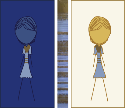
The RGB colors of both dresses are the same. The effect (that the perception depends on the environment) is obvious. This was also obvious to Randall Munroe, the genius behind XKCD. And, I suppose, it was not this very obvious fact why he created the cartoon. I think the most important message of his cartoon number 1492 is, as so often, hidden in the image title on xkcd.com/1492 (seen only when keeping the mouse pointer a while on top of the image):
This white-balance illusion hit so hard because it felt like someone had been playing through the Monty Hall scenario and opened their chosen door, only to find there was unexpectedly disagreement over whether the thing they'd revealed was a goat or a car.
Please, chew on that, for a minute. Randall suggests the following scenario: What is behind the door? Car or goat, car or goat, car or goat, car or goat? Now you open the door. And you might say: oh, I am not sure whether this is it a car or a goat. And you think you now have to decide between both, because car is great, and goat is bad and everything else is not important. You have lost capability to see and realize that it is neither of both. People are so focused on seeing either of car or goat that they lose their ability to judge neutrally what they see.
This is Randall’s way of criticizing how people are asked about this very dress issue and about how media fails in attempting to resolve this issue. Media is creating a bias in this discussion, which clearly prevents a neutral analysis. In fact, what happened is a phenomenon that can be described as social self-amplification, converging towards a tremendous simplification of the problem, and towards the wrong questions being asked, eventually yielding the seemingly only viable options of white/gold vs. blue/black.
The essential ingredients for understanding the issue
Rollback. By now it is clear that we should forget about white/gold vs. blue/black, and focus on what we actually see. This might read trivial, but is the primary insight for treating this topic on a scientific level.
What we actually see is, from my “scientific” experience, built of four major components:
- the working principle of a camera for taking a photograph
- the flow of information from the camera towards a digital picture
- the flow of information from the digital picture over the screen into your eyes
- the flow of information within your brain
Hence, there are multiple levels of information and information flow involved. The actual color information in the picture is just a part of the “global picture”. However, it is the global picture which one needs to have in mind when one wants to rationally grasp WTF this is about. So, when Adobe tweeted
For those seeing #WhiteandGold in #TheDress (http://bit.ly/1APDFay ), @HopeTaylorPhoto ends the debate.
they made a fool of themselves and approached the problem at a wrong level, not looking at the entire flow of information.
The essential concepts for assessing the dress color problem, distributed over four levels of information flow, are not that complex and shall be discussed within the next few paragraphs.
The role of camera and digital modification reduces the problem
Depending on the exposure and white balance settings, a camera records very different images of any given scene. You do not need to exactly understand what these two things mean. You just need to appreciate that color and brightness as recorded by the camera might be very different from what a human being would have observed in position of the camera. Simple, right? Then, once the image has landed on a computer, it can be edited. In any way. The first two points from the list above boil down to the following conclusion: a photograph that you did not take yourself and that you did not digitally edit yourself might show anything far from what the actual, real scene looked like to humans. Still simple, so far.
I think the most important conclusion from here is: based on a random image circulating the Internet, it is pointless to discuss which color the dress really has. This might sound nitpicky to you, but in fact this relaxes the problem a lot. The important insight from here is that asking for the real color of the dress is an ill-posed problem. It is a waste of time to even think about the real color of the dress. A valid question left is: what color does the dress have in the image?
Take the colors for granted, just for a moment
I fear that my last point might still might appear a little nitpicky. But it is essential, so I’ll use a second approach: there is no point in interpreting this photograph with respect to the real lightning. The flow of information from the real scene towards the digital photograph implicates a loss of information. This is irreversible. Furthermore, the information that is contained in the image underwent transformations whose details we do not know (remember: we did not take and edit this photo by ourselves). Hence, the remaining information can not be used to make resilient conclusions about the lightning in the real scene.
The point is: if you want to approach this scientifically, forget about the real scene, really. I mean, you can do whatever you want, but if you incorporate the real scene of the dress photograph in your thought process, then you are making unsupported assumptions and leave the scientific regime.
When one follows this logic, the only valid way to answer this question (“what color does the dress have in the image?”) is to quantify the colors in the image. Quantification usually happens through “measurement”, which is an important concept in science. During a measurement, a certain quantity is determined. The measurement yields a number, and the number has a unit. Measuring should exclude experimental errors as far as possible. Naturally, a measurement transforms one type of information into another. Now, you might just use a calibrated screen and a calibrated camera and then display the image on the screen and then point the camera to the screen and then measure colors. Or you stop over-interpreting this very simple problem and realize that in this case there is no need to transform information another time. The information we are interested in (the colors in the image) are already there. In the digital image file. Just read them out. There is no point in performing another measurement.
So, now we look at the colors encoded in the digital image file. Others have done this for us. This is one of the most comprehensive results I have found (in a Reddit discussion):
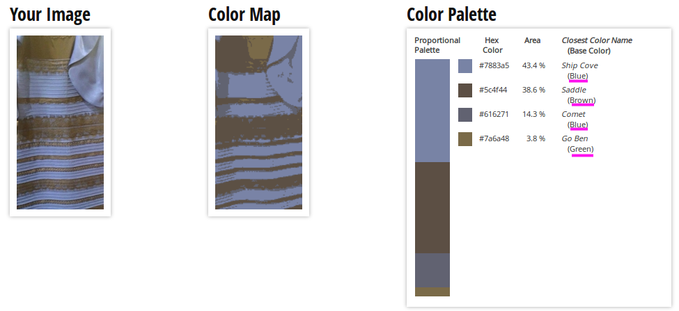
Given the dress photograph as data source, we now have (scientifically) obtained a conclusion (you might want to name it a “fact”): The two main colors of the dress in the image are blueish and brownish (the RGB unit system is unambiguous, and its transformation to “words” at least follows a reproducible system, by neutral standards).
The last step of information flow: error-prone extrapolation
The remaining level of information flow happens within the brain of the one observing the image. Clearly, there is an interesting relation between the distribution of colors in the image (not in the scene, in the image), and human perception/imagination of the two main colors of the dress in the real scene. I appreciate that when forced to imagine how the dress might have looked like in reality, certain people argue that they think it was white/golden or blue/black. Fine with me, and I believe them: Clearly, this particular image has a weird light constellation, so that it requires a huge amount of extrapolation towards imagining the real lightning in the real scene. A huge amount of extrapolation based on bad data yields an unstable result, even when using a computer and a numerical approach. Now, this is not a computer. This is brain. Higher complexity, many more degrees of freedom and clearly a larger potential to end up with different outcomes when extrapolating. Same person, different attempts, different outcomes. Different persons, different outcomes. Really, this is not surprising, and there is not right or wrong, because the underlying data is bad.
I asked myself: which colors do I see in the picture? Honestly, “blueish” and “brownish” were the colors I saw. I actively denied to think further than that, because I knew that it does not make sense to over-interpret that picture. Because so much information was lost on the way from the real scene towards the image on my screen. Because, obviously, this is a bad photograph. You know that when you work with photographs. And when I looked at this picture with friends and we discussed which colors we really see (without thinking), everybody agreed on seeing blueish/brownish.
Wrapping up
The discussed confusion is due to a “real” quantity (something that is physically measurable) being measured under unclear conditions, manipulated to an unknown amount, and then interpreted by human brain. The interpretation may differ from person to person, depending on the question and depending on how the person trained his/her brain (without knowing) throughout life. As clarified in the article, there is no right or wrong about what people say what they see here. It is just that every honest answer to the question “Which colors does the dress have in the image” is the result of either
- a neutral color analysis based on what is in the image (without extrapolation)
- or a complex extrapolation thought process (subconscious or not) with the goal to identify the real scene lightning.
The latter is, as argued, an ill-posed problem and people are weighting different aspects of this thought process differently, which is why the outcome is different. Media turned this whole story into something that looks super magical, because asking whether he/she thinks if the dress is white/gold or blue/black and suggesting that only one solution is correct is very different from asking “which colors do you see?” and manipulates people.
Leave a Reply